Recent Posts


CATALOG SHOULD BE A SEPARATE PAGE AND SHOW ALL THE...
yeah basically the title, instead of the next-post insufferable bullshit just make a single entire page showing all the posts on the catalog page this is basically Quality of life suggestion but worth cause once the thread is off the main pag...


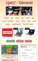
/porn/
When are you gonna make /porn/ board admin? Saale bhangi kaamchor din bhar gaand pasare aaram farmata rehta hai, thoda kaam dhanda karle nirlaj Aaj ke aaj mereko /porn/ board dikh jaana chaiye Haath chala fatafat
abey lodu admin why this post is not deleted yet? faaltu ka spam kar rakha hai /g/ board pe. https://bharatchan.com/post/g/view/12828
Dyaush saar tor and VPN ain't working
And make the dark theme default please, ot like device default how somehow Google detects it. At the same time though don't datamine much data.


Petition to make an NSFW board
This is for the mods. It'd be great if this site had an nsfw board as well dedicated solely to explicit content. This would be in addition to the somewhat nsfw content posed on /b/. All the major imageboads usually have an nsfw board it'd be nic...

admin fix your e-mail
can't send mails to you > Undelivered Mail Returned to Sender > <[email protected]>: said: 550 No Such User Here (in reply to RCPT TO command) if i can't send a mail just tell me a way to contact you, i had created a thread long bac...
What are you doing admin?
Admin do the following for truly anonymous experience. Start deleting posts that are a fucking month old and de-bumped into oblivion. Make this website unarchivable. [MAJOR] Turn off the option of namefagging, and remove any mention of namef...
improve the website
anonymous
udu6QA
improve the website design
anonymous Created At: Thu Apr 18 2024 09:55:25
anonymous Created At: Thu Apr 18 2024 10:58:58
yXwKfY

>>5170
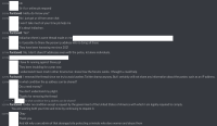
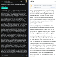
Make the top bar more obvious that it has something to do with dragging around. Maybe make it look like an actual window or give it some texture.
the bottom part has too many buttons
fix the captcha system, that's one less button, you can just put a little refresh button on the captcha image itself
like other anon suggested, put the close button at the top right like an x in a circle, that's one less button again
Finally, with the last submit button, you can make it slightly bigger.
Also, apply the skin to Choose Files element as well. It's a bit trickier but it can be done.
The font size and style in the location and username fields, and the captcha field are all inconsistent. Use just one common style for them all.
Also, offset the word count padding from the right on PC. Since the 2000 appears as a 200 due to the scroll bar
anonymousCreated At: Thu Apr 18 2024 11:01:01
yXwKfY

>>5190
Also, resizing the text area should resize the whole window
+
Let us see what image we are uploading by showing a little preview/thumbnail, with the option to delete it or censor it and change filename as inch allowed.
It can be fucky if somebody uploads something unexpected without a preview.
Detective Goonkesh Hawshi !yTQNrLpqwaYmMYkCreated At: Thu Apr 18 2024 11:03:06
A/CXp6
>>5190
>top bar
put three dots on it that should be enough
also add a file preview in the reply window
anonymous Created At: Thu Apr 18 2024 11:13:57
GTh8Kk
you have to scroll way too much to get to the recent posts section on the main page
so i wish that could be improved
anonymousCreated At: Tue May 07 2024 02:22:43
CoyHTR
>>5170
>What do you think needs improvement?
1. round corners ugly 🤮🤮🤮🤮
2. media/assets load slowly on site but when open in next tab loads immediately
3. no dark theme
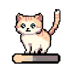
4. stupid cat in the corner
5. timestamps are not correct
... will add more
anonymousCreated At: Tue May 07 2024 02:35:46
o/GxjV